Karibu Lounge
Website Redesign

Overview
Karibu Lounge is a local wine lounge located in downtown Alameda, California. It is the home of Wachira Wine, a wine label created by Christine Wachira, the first Kenyan American wine owner in California. Karibu Lounge is a cornerstone of the community, giving home to minority wine and beer creators. Known for its weekly live music and cultural events, Karibu has embodied its Swahili translation by making everyone who walks through their doors feel welcome.
Problem Statement
Karibu's current website exhibits an outdated and flat design, lacking a modern tone that adequately reflects its values and social mission. The wine club and weekly calendar, as essential features, require a more engaging visual and interactive design to enhance accessibility and visibility in order to better appeal to a broader customer base.

Client: Karibu Lounge
Role: UX/UI Design
Duration: 4 weeks
Challenge: The existing website for Wachira Wines lacked user engagement and did not effectively showcase the wine lounge's offerings.
Process: In order to solve this problem I conducted user research and collaborated with stakeholders to design a more user-friendly interface, focusing on visual appeal and intuitive navigation.
Outcome: The redesigned website improved user experience and engagement, making it easier for visitors to explore events and offerings, ultimately driving more traffic to the venue.
Research
Goals
While conducting my research my primary goals included the following:
Determine what key features are the most important to the business.
Uncover the main reasons customers visit the website and what information they look for.
Discover what key features do users expect to see when visiting the website.
Define what information is unclear or difficult to find on the current website that could be improved.
Methods
After careful consideration I came to the conclusion that the following methods would provide the best insights.
Competitor Analysis - Observing how other organizations in the wine industry are marketing themselves online.
Owner Interview - Interviewing the business owners to determine their goals for the website.
User Interview - Interviewing customers and potential customers to see how their expectations meet the business owners goals.
Survey - A general survey to collect more data on user expectations.
Provisional Persona
A preliminary persona was developed to gain deeper insights into the target audience. This provisional persona played a crucial role in identifying the most suitable individuals to interview during the research phase, aiding in refining my understanding of the customer demographic.

Competitor Analysis
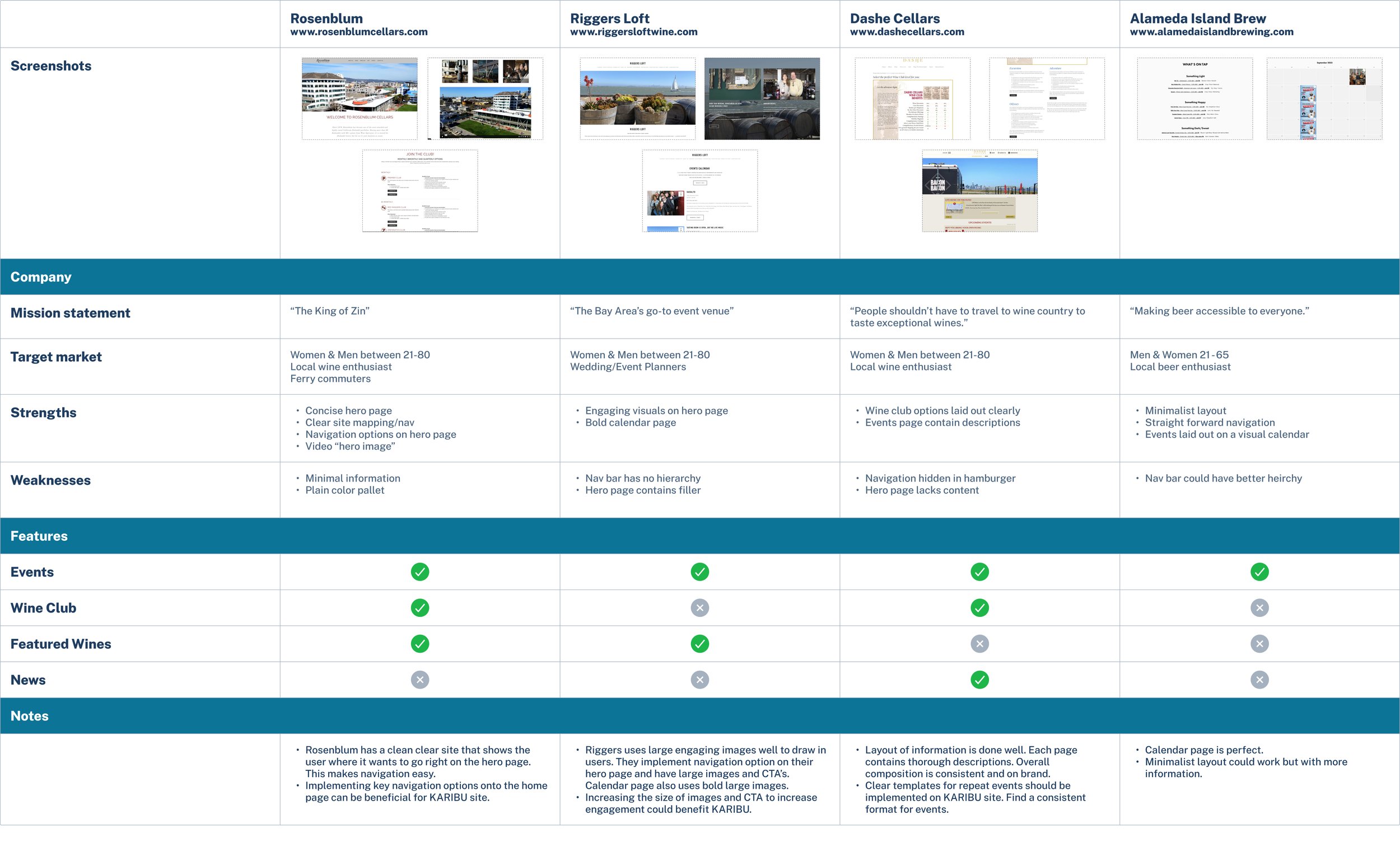
Owner Interview
Interview with Chadwick Spell, COO of Wachira Wines.
Survey & User Interviews Results
Following a comprehensive series of interviews and a survey distributed directly to the Karibu customer base, I uncovered some interesting insights. The survey results revealed that the primary reasons that customers visited the website were predominantly to explore events or make reservations, closely trailed by seeking information about the wine club.
Findings
After an in depth discussion with the owners, I found their priority was to enhance features that boost visits, event attendance, and online sales. They emphasized user-friendly aspects for older users, such as easy scheduling, integrated shopping, and detailed event information.

Regarding users primary objectives on the website, scheduling tastings, browsing available wines, shopping, and accessing information on events and the wine club were of utmost importance. This underscores a collective preference for a more user-friendly website that offers seamless access to pertinent information.

Findings
Users reported encountering challenges with the website regarding check-in procedures and appointment scheduling and expressed frustration with the top navigation bar's complexity, which led to navigation difficulties. To address these issues and improve user experience, suggestions included simplifying the top navigation bar by reducing sub-menu options and enhancing the website's visual hierarchy. Additionally, users recommend refining the reservation process and integrating free content to further enhance the overall value of the site. The overarching focus remains on optimizing navigation ease, maintaining visual coherence, and providing well-structured information.
Define
By analyzing my research findings thematically, I systematically broke down the results, providing a clearer framework for processing the information.

Upon organizing the findings, correlations emerged between the business owner's priorities and the aspects highlighted by users as significant.

Ideate
After a brainstorming session, two additional features were conceived to complement the site's reorganization. The primary addition involved implementing a pairing page, showcasing recommended food options to complement various wine selections. The secondary feature entailed introducing a multiple calendar view, enabling users to seamlessly switch between different calendar viewing modes for enhanced visibility.


Once I outlined the changes needed for the site, I created a site map to provide the structure for my design.

Branding
After establishing the site's outline, I proceeded to develop its branding by creating a mood board. I concentrated on visual elements that resonated with the business's theme and explored fonts and colors that would align with the brands identity.
Mood Board

Color Palette

Prototype
Low Fidelity Sketches
Once the branding was established, I began the brainstorming process by creating low-fidelity sketches and then loosely translating them into digital format.


Mid Fidelity Mockup

High Fidelity Prototype
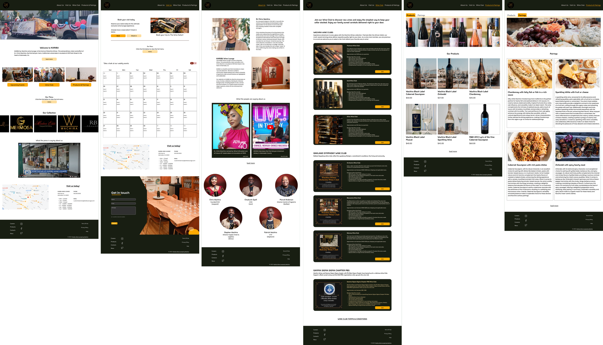
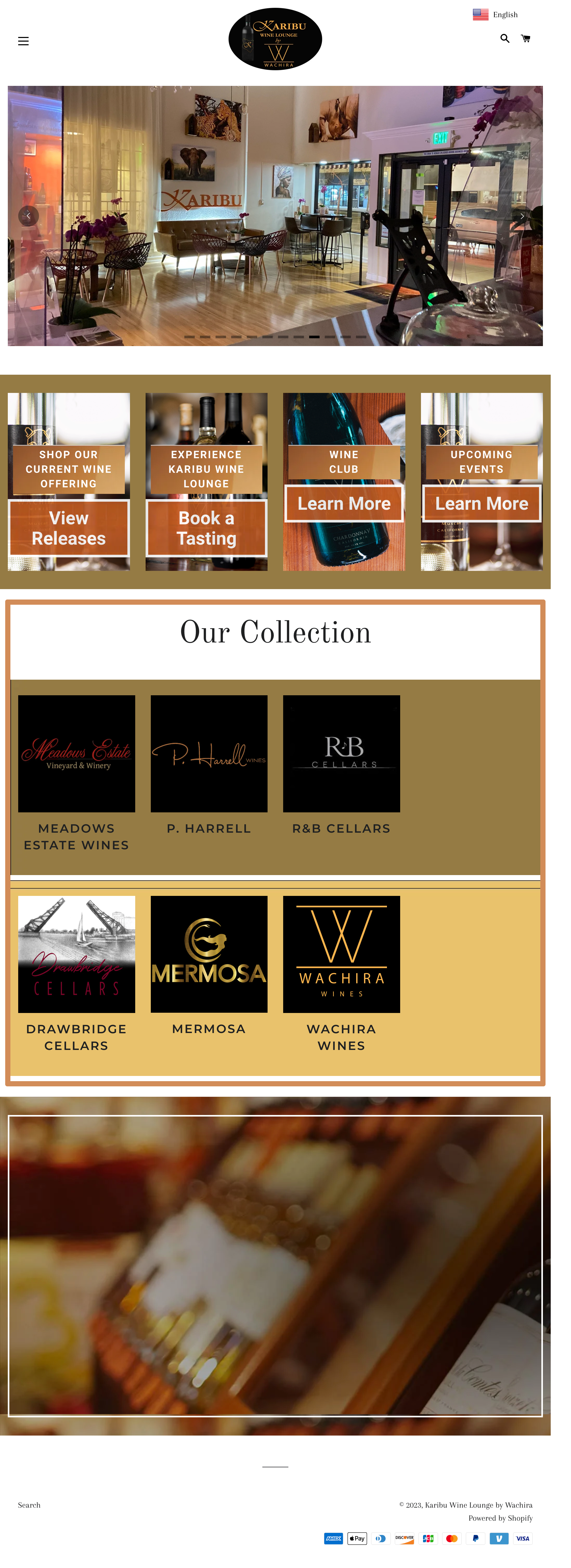
My high-fidelity prototype seamlessly integrated elements of the existing webpage with the suggested features derived from my user research. This combination resulted in a significantly more user-friendly interface, effectively highlighting important information and providing a more intuitive hierarchy overall.

The Feedback
After presenting my redesign to the Karibu business owners, I received highly positive feedback. They were particularly impressed with how the new design felt less cluttered, providing a clear visual flow that guided site visitors to important information. Previously, the original design was often criticized for being difficult to navigate. The new design addresses this issue by reducing the top navigation and consolidating pages, making it easier and faster for users to locate relevant information.
Before
After

One key aspect that required revamping was the events and booking page. In the original site, these pages were separate. By combining these pages into a singular ‘Visit Us’ page, I reduced the number of navigation options and enabled users to see upcoming events, making it easier to decide on booking dates. Additionally, I incorporated frequently sought information, such as hours of operation and contact details, so customers could easily reach out with questions about the booking process or availability.
Before

Before
After

Another major change was simplifying the wine club page by consolidating all options onto a single page. This was a significant improvement over the original site, which was unnecessarily complicated and made comparing wine club subscriptions difficult.


After

To conclude the redesign, I created a product and pairing page that combines the shop with a blog-like section for suggested food pairings with the lounge's products. This feature was added based on user feedback seeking more informational content. Both users and business owners welcomed this change, showing increased interest in visiting the site for more than just bookings and information. This addition has effectively enriched the user experience and boosted overall site engagement.

Takeaway
From this project, I learned the critical importance of listening to both customers and business owners when working on a commerce website. Balancing and merging the needs of both parties is essential to create a cohesive and satisfactory product. From a design perspective, I also realized how vital a clear, clutter-free layout is to ensure a functional and effective user experience. Meeting the expectations of both users and stakeholders requires a thoughtful approach to design that prioritizes simplicity and ease of use.