Client
UX Academy


My Role
UX/UI Design
Duration
4 Weeks
Challenge: The project aimed to create an end-to-end learning application that addressed user needs for an engaging and efficient study platform.
Process: Engaged in thorough user research and prototyping, iterating designs based on user feedback to ensure functionality and usability.
Outcome: The final app design significantly improved user experience, making learning more accessible and enjoyable, ultimately empowering students to achieve their educational goals.
Overview
Study Hall is a platform that empowers individuals to effectively learn and master new skills while building community.
The Challenge
Why do people fail? I tackled this project by examining the factors that cause users to struggle when learning a new skill. By identifying these underlying issues, I was able to introduce tools and features that help users stay on track and achieve their goals.

Research
Research Goal
The goal of this research project was to find out the following:
Why people fail to follow through with learning a new skill?
What tools do they use when attempting to learn something new?
How can these tools be improved?
Does having a community help users stay motivated?
How are users quantifying their learning process?
Methods
In this research project, two main methodologies were employed:
User Interviews: I conducted interviews with participants who attempted to learn a new skill but failed. This provided insight into their struggles, the obstacles they encountered, and the tools they wished they had. This qualitative data highlighted participants' experiences and pain points.
Surveys: I surveyed participants about the skills they want to learn, their learning styles, average study time, and how long they persist before giving up. This quantitative data helped me understand broader patterns and preferences.
Personas


The average user is a young adult between the ages of 20 and 35, seeking to learn a new skill that will bring fulfillment to their business or personal life.
Research Methodologies
For this research project, I found that user interviews were the most effective method for gathering data. Speaking directly with users provided first-hand accounts of their online learning experiences, allowing me to gain a deeper understanding of their frustrations and motivations.

Define
Data to Ideas
After consolidating the data from my research, I started generating ideas to address users' pain points. By using 'How Might We' questions, I visually mapped out these ideas for better understanding.

Key Platform Features
After exploring various idea paths, I concluded that there were three key features that resonated with my users.
Short form content
Multiple learning options
Course Community
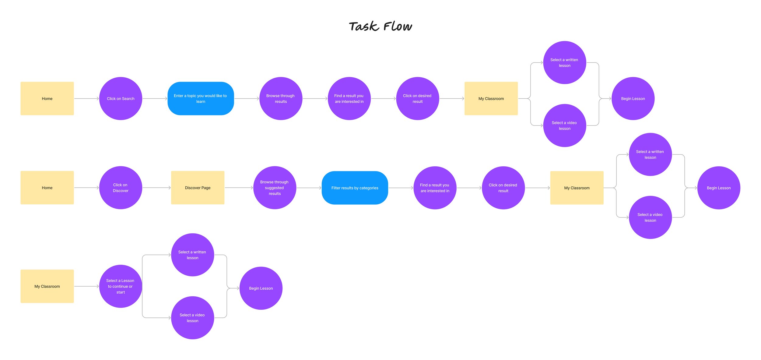
Task Flow
Using the site map as a guide, I created a task flow that outlines the steps users will follow to achieve specific goals.
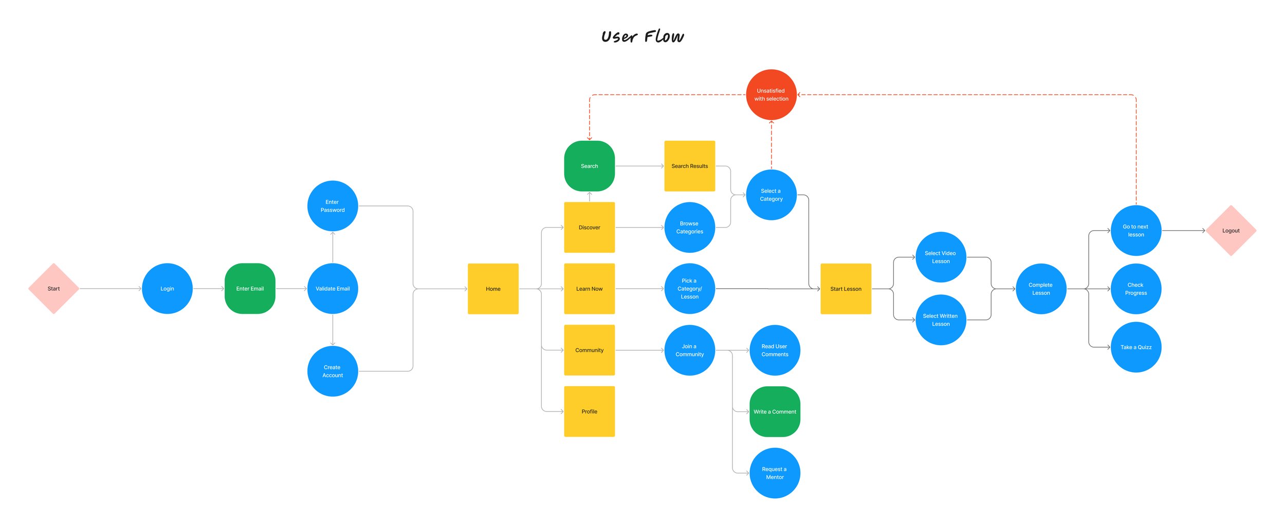
User Flow
I then created a user flow to further illustrate the steps required to complete the task flows.
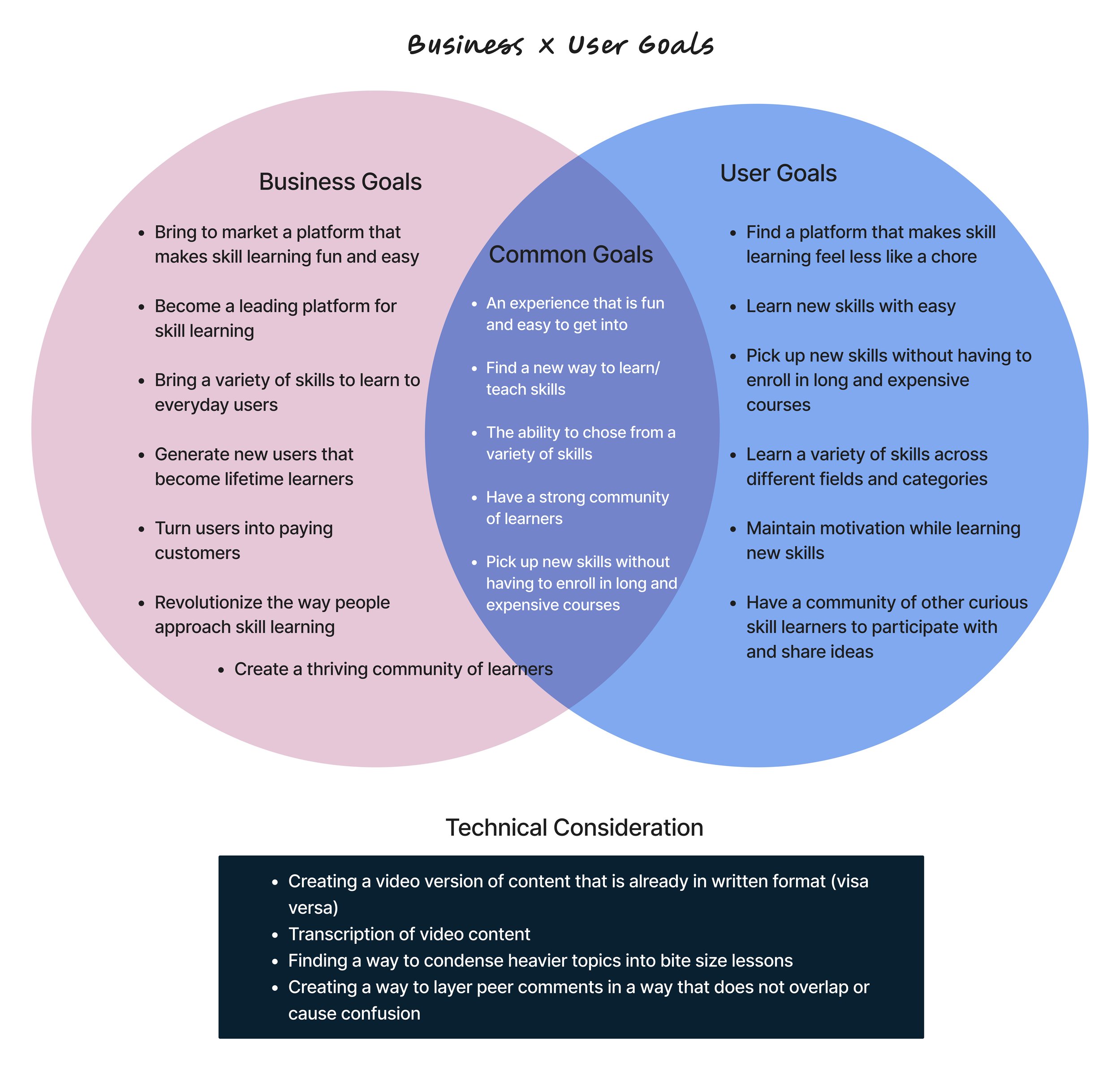
Business Goals
By aligning business goals with user goals, I gained a clear understanding of which design aspects were most crucial to implement. Ensuring the design was intuitive and user-friendly, while providing in-depth learning methods, were key features to consider. Combined with a robust community section, my design effectively meets both business and user goals.
Ideate
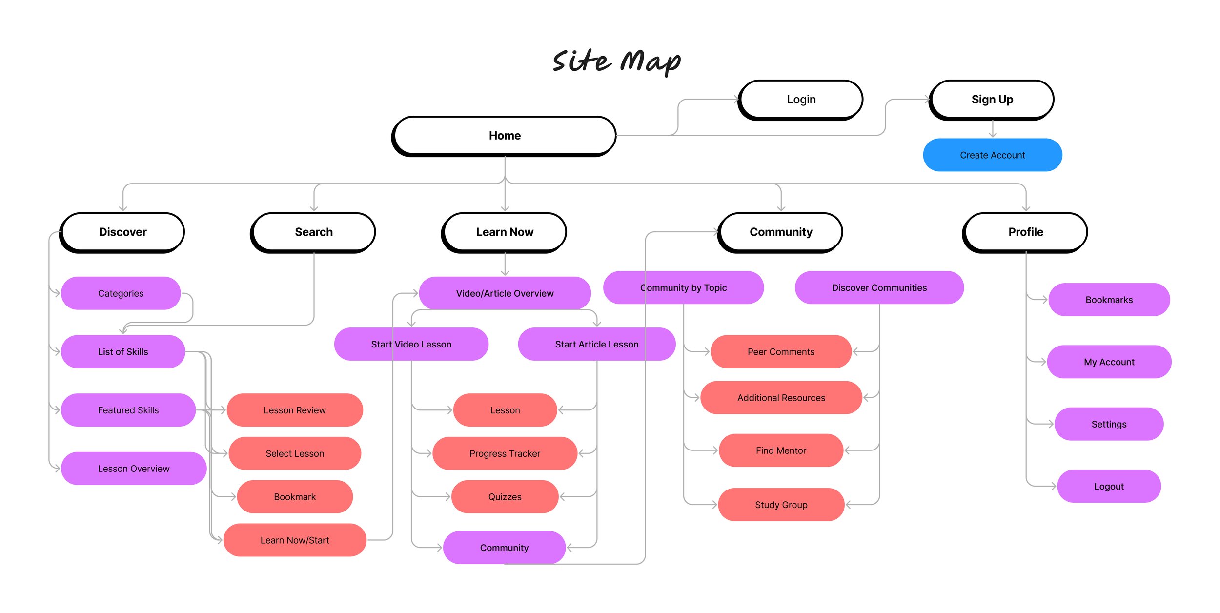
Site Map
After defining my key features, I created a site map to begin organizing the information for my product.
Prototype
Low Fidelity Sketches
I chose to utilize low-fidelity sketches because they helped me explore ideas about layout designs and establish potential hierarchies for key features.

Style Guide
For the typography of this design I decided to go with the font Amiko because of its range of boldness as well as its clear and legible typeface.
The color palette I chose reflected those of curiosity and exploration but also provided a solid contrast. The brightness of the secondary color worked well to bring attention to key components in the design.

Typography


Mid Fidelity Sketches
After completing sketches, I moved on to digitizing my designs into mid-fidelity mockups. This step enabled me to digitally create components and rearrange them to better visualize and refine my design.

High Fidelity Prototype
After defining all elements, I proceeded to build my high-fidelity mockup, which later became the basis for a working prototype. This prototype would guide users through the task flows outlined in the previous section.

Test
Usability Testing
Objectives: The goal of this usability test was to explore how intuitive the Study Hall Design is. Are users able to successfully browse potential lessons, select one, and get to the start page? Assuming they are a new user, how intuitively do they navigate their way to completing a new lesson?
TaskFlows: The task flows I tested were how the user goes from the home page to selecting and starting a lesson.
Browser homepage
Select Lesson/Category
Begin lesson
Summary: From the User Testing I was able to determine the overall flow of my design to be high in usability. My test participants were asked to complete the task flow of browsing categories on the home page, selecting a course/lesson, and navigating to the courses “start” page where they would have the option of exploring an associated community. All of my participants were observed completing this task flow with little to no complications and reported that the usability was simple and easy to understand
Feedback: The main points of concern revolved around the following:
A notifications option or some way for the user to re-engage with the community section after they had made a contribution.
Making the search bar more accessible (possibly replacing it for a notification tap in the navigation bar)
Redesigning the Login Page to incorporate more information (Landing page v. Login screen)


